
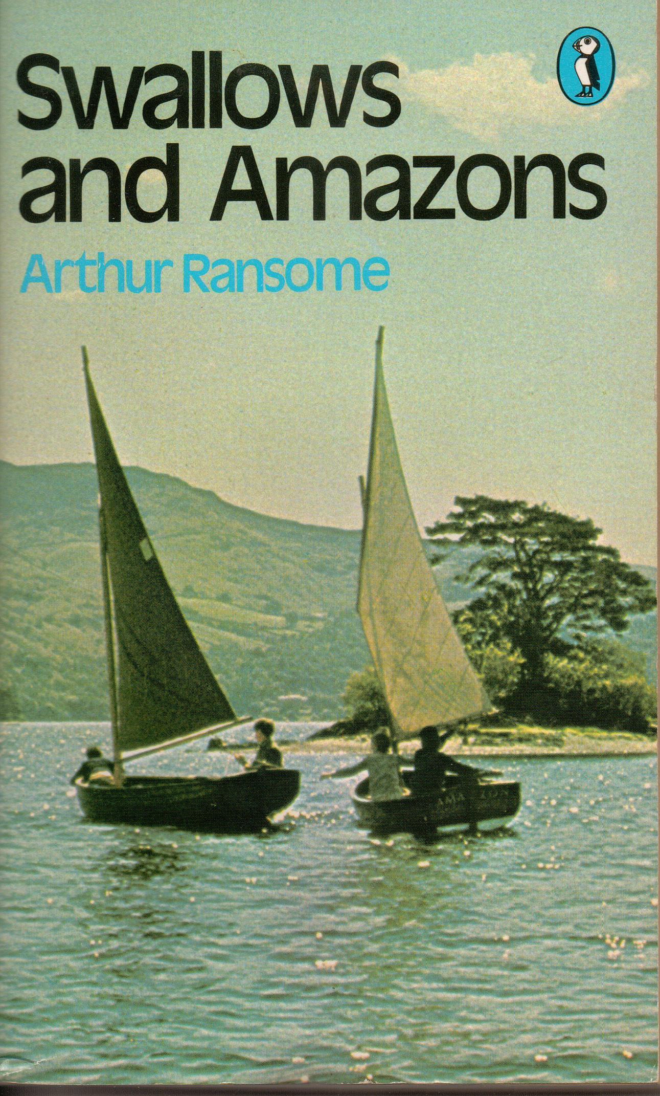
When the EMI/Theatre Projects film of Swallows & Amazons was released forty-eight years ago, Puffin books brought out a paperback featuring the dinghies near Cormorant Island on the front cover. The photograph was taken on Derwentwater at the point in the story soon after Titty has been found to have captured the Amazon. Did you ever have one of these?

Nancy and Peggy Blackett are featured on the back cover, hiding in the reeds at the mouth of the Amazon River. We were invited to a Puffin Club party at the Commonwealth Institute to launch the book. It was re-printed twice in 1974, which might reflect the popularity of the film. 75,000 copies were brought out.
Unbeknownst to me, Heinemann Educational books brought out this cover in 1982.

The photograph would have been shot when we were rehearsing the scene when the Swallows first land at Peel Island on Coniston Water. It was mid-May and I got terribly cold in my thin cotton dress. Suzanna wasn’t feeling well and were all tired, as you can see.

Almost thirty years after Richard Pilbrow released the movie, a hardback was produced with a tinted black and white still from the film taken when we were fishing in Shark Bay. This was shot on Elterwater, a small reedy lake near Windermere. We have Arthur Ransome guardians to thank for this. The draft copy had a rather clonky cartoon that they were not happy with. It can be seen by clicking here.
This book cover was advertised every day for a week on the front cover to the Daily Mail and profiled in the magazine as one of their thirty books featured in their Children’s Golden Library collection.

The offer was featured nationally in a television commercial. I saw the advert myself a couple of times and wondered what effect the promotion would have. Simon and I weren’t given any warning and received no remuneration for having our faces spun around in the advertisement, although a box of books arrived unexpectedly at my house. I gave one to the lady who was translating Swallows and Amazons into Chinese.

This hardback is often available on eBay, where I found this 1992 edition published by Cresset Press. I hadn’t seen it before. Suzanna Hamilton thought the choice of photograph rather bizarre.

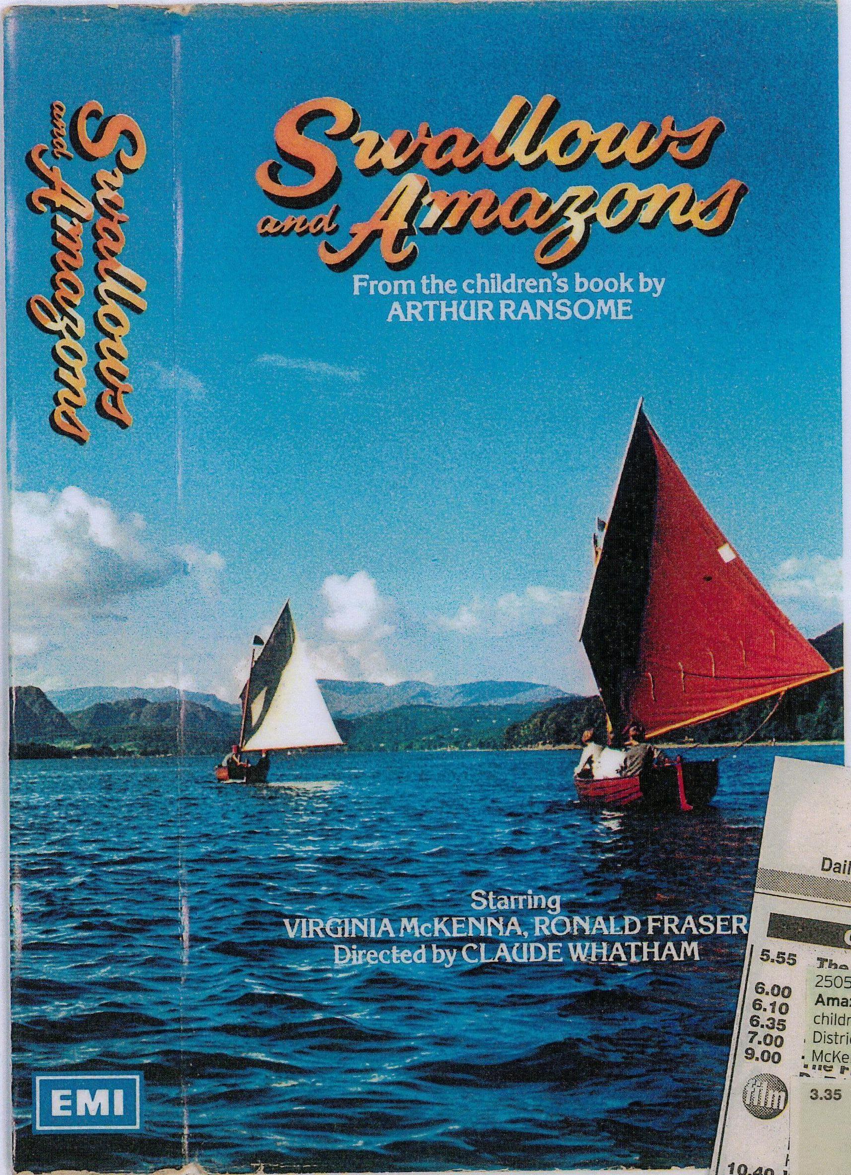
I preferred the still from the movie used on the cover of the first VHS tape.
This is probably because it reminded me of the 1970 Puffin book cover that I read as a child and took with me to the Lake District when we started filming in May 1973. I underlined all Titty’s dialogue in pencil.
The cover of this audio cassette tape ‘talking book’ is quite interesting. Which scene does it depict?

Mike Dennis wrote in to say:
‘It’s an abridged version read by Bernard Cribbins, originally released as two cassettes. He does a good job but I seem to remember the adaptation is a bit rushed towards the end to get the whole story in to the time limit of the cassettes (2 hours), it was released by EMI’s ‘Listen For Pleasure’ division.
The publishers, Red Fox, commissioned an illustration for their cover along the same lines, depicting the characters in the 1974 movie.

The current designs for Arthur Ransome’s paperbacks were on display at the V&A after winning the Book Cover Illustration Award. Association with the movie can hardly be claimed, but hopefully the film will have helped to keep Ransome’s stories on the shelves of bookshops worldwide.

Possibly as a result of this, or perhaps because they just liked the colours of the design and the book, Apple iPad featured the cover on their illuminated advertisements seen around London:

I walked up the steps of Tower Bridge underground station to see Swallow’s flag flying: fabulous!

Robert Thompson has made an online survey including covers of all the children’s books by Arthur Ransome, which you can access by clicking here.
Does anyone know of any other book or audio tape covers that used photographs from the film? Do add your comments in the box below.

Sophie

The rejected cover of The Daily Mail version of S & A you refer to I assume is this one
Sorry the scan is not great, but it is from a copy I bought on e-bay and it was given away with the Scottish edition of The Daily Mail, otherwise the content is the same as the version you show.
What a cover!
What would the Ransome’s have said about it?
May I add the link to the blog post?
Sophie
Of course! There are similar ones on various Websites for the editions published in Eastern Europe, seems to make believe the content is rather ‘jolly’! As you say, what would Ransome have thought!
Thank you!
Hello Sophie,
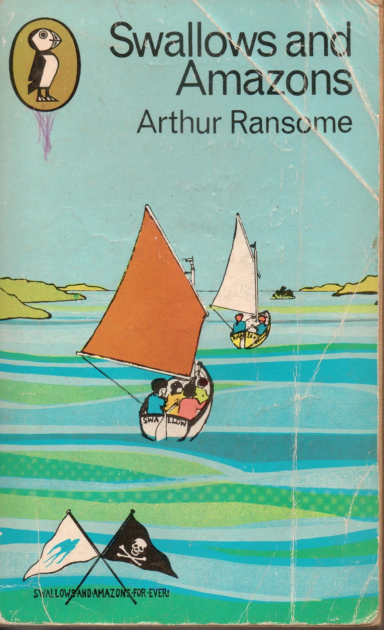
The cover of the 1974 Puffin edition brings back happy memories as it was the first version of ‘Swallows and Amazons’ that I bought (in about 1982).
I prefer the old Puffin cover illustrations (on the S&A series as a whole) to those of the more recent paperbacks. I think most, if not all, were based on Arthur Ransome’s own drawings to illustrate the text?
Oh yes, I’ve always loved Ransome’s illustrations although I was frustrated by his poor figurative work. Captain John has a horribly large head in the adaption of his drawing on the cover of the Puffin book I had as a child.
I do quite like the new design although they needed to put more research into the design of yacht featured in WDMTGTS. The Goblin was a Bermudian cutter with a pointy triangular mainsail. I know I’ve mis- spelt Bermudian. Oh, dear.
I was given the 1974 edition when it came out. I was six at the time and was not normally interested in fiction because I found most stories written for children to be dull and insulting, typically infested with talking animals, but the picture on the front of this one made it look a lot more promising. A few chapters later, I wanted to be a writer.
For some reason I didn’t see the film until a few years later when it was shown again, this time to an almost empty cinema.
My opinion is that the cover has to inspire one to sail.
Perhaps I should re-thing the cover of my own book. It is designed to inspire one to get up to the Lake District and search for the locations. What do you think?
I think that photo did both, and by being a photo rather than a drawing it states clearly that sailing is a realistic real-world thing for children to do rather than just a fantasy. As for your book “The Secrets of Filming Swallows and Amazons”, the existing cover is already superb, but I wouldn’t want to rule out the possibility that a photo with you (and the others) in a boat that would help sell it even better – that’s for you to judge. I do like the map though. By the way, was all Kit’s dialogue replaced by the voice of a boy? If so, I can’t help wondering if she hated the film as a result.
I love the photo of us sailing past the houseboat that I have pasted up on my ‘Swallows & Amazons’ page.
The answer is yes, and no.
Oh, I like that picturre – it probably would work equally well, though it would have to lose a bit of the edges to straighten it up. The white thing just ahead of Swallow (perhaps it’s spray from another boat just out of shot to the left) could probably be photoshopped out with an hour’s work.
Whatever else a cover does it has to COMPETE, to attract the eye away from other covers, either in a bookshop or on the web. I suppose the description to aspire to is ‘striking’.
Which S&A cover if your favourite?
I like the 1974 Puffin cover, although it rather lacks colour, so rates A—. The Red Fox cover catches the spirit very well, and their covers were certainly striking — you either love it or you hate it! The Heinemann design appeals the most and the border seems to give it echoes of a cinema screen, but it is spoilt by its strange monochrome image. It could have been a real winner in colour!
It seems they all attempt to capture the excitement of sailing -although there are better photographs available.
I prefer the Puffin covers of coloured versions of Ransome’s drawings (though their choice of colours is often to minimise the number of colours used rather than what looks good!)
The Red Fox covers are good attempts, but the artist(s) is rarely credited.
I have always been inspired by Ransome!s drawings. I don’t have any affinity with the Red Fox covers but expect children like them. The question is, would the photographs attract new readers?
The same iPad advert artwork was also used at Toronto airport and in the Eaton Centre downtown, probably elsewhere too but those were the only two places I heard of.
I also have a copy of the film still cover of the paperback Swallows and Amazons, I bought it in Canada in 1982 or 1983.
Thanks for letting me know, it’s fascinating. Which is your favourite book cover?
Puffin and indeed Penguin had an extraordinary graphics divisions until late 1970’s – generally simple two colour graphics, but with the capacity to draw the eye and actually give immediate sense of the content.
They were genius, the advent of far cheaper full colour printing lent itself to photo reproduction post 1980 and it quickly assumed dominance. It’s remarkable if look at pre 1980 books how limited the colour photography is, a lot of black and white photography and rendering, and it was often much more explorative and stimulating.
The Puffin Club article about the film was illustrated and laid out in a way that never dated and always attracted the eye, making the best use of Albert Clarke’s iconc black and white stills. It was notably better than any other mgazine or newspaper coverage in the UK, which included most of the well known publications. The TARS library has a copy of the Kaye Webb’s biography that profile’s the Puffin Club and the legacy she left the book world. You can see one page of her article here: https://sophieneville.net/2011/10/01/swallows-and-puffins-the-film-the-paperback-and-the-publicity/
I’m coming to this discussion very late, but I had the 1974 Puffin version on the cover of my copy, bought in 1982. When I was given the rest of the series over the course of the next couple of years, I was rather disappointed that they didn’t make a “set” since one was photographic and the others based on Ransome’s drawings.
I always wondered what the “Ransome drawing” version of that particular edition’s covers looked like. I can’t say it’s one of the best – the boats are too big for the lake, never mind John’s head!
What puzzled me as a child was why the Amazons were waiting in the reeds (on the back cover) in what was obviously daylight. I know about day-for-night filming now, but it never made sense back then.
That’s a good point. One wonders if the cover designers or executives making decisions actually read the books. I almost typed the wood reed then, as I was thinking of the reeds and the fact that it could be seen as a photographic typo. Puffin have just bought out a new cover with the poster of the new film. I like all the graphics they have used except for the map, which really should be cartographically true to the one in the books. Have you seen the new film yet?
As well as the ‘standard hardback’ covers I have the ‘Daily Mail’ version of ‘Swallows and Amazons’. I really love the the 1970s Puffin paperback covers.
The Daily Mail book cover was featured on BBC Antiques Roadshow quite a bit!
It was. I did notice!
It was a good choice of photo – hand tinted.
Yes, very nice.